


There are a number of useful tools available to analyze Coronavirus data such as number of cases, number of deaths, number of recoveries, number of tests, deaths per million in the population, etc. You may find some of the tools listed here helpful in understanding the data now available.
- Coronavirus Dashboard – this was developed by Avi Schiffmann, a high school student in WA state in the early days of the coronavirus pandemic. Provides confirmed cases, deaths, tests, recovered, etc. per country. Data is broken down into regions, provinces in Canada, and states in the US.
- CDC Coronavirus (COVID-19) home page – starting point for analyzing Coronavirus data in the US – includes cases, data, and surveillance for states in the US.
- Coronavirus Update – Reported Cases and Deaths by Country, Territory, and Conveyance.
- Coronavirus Pandemic Data Explorer – Confirmed cases, confirmed deaths, and tests per country in chart form. This one shows the number of deaths in ten countries of interest. Moving your mouse from left to right shows how the numbers increase day by day in each of these nine countries.
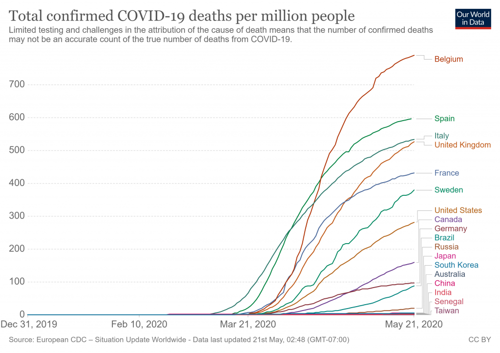
- Coronavirus Pandemic Data Explorer – Confirmed cases, confirmed deaths, and tests per country in chart form. Eight more countries added. This chart shows the number of deaths per million in each country. You can show data in chart form, show data numbers, show data sources, and download data. The number of ways in which you can display the data is remarkable. Try it, you will like it. We can now compare the death rates per million for each country. Here are a few noteworthy examples. We have to regard the numbers as tentative since deaths are counted differently in countries, and even in some states in the US. But this is a start.
- Belgium – 789, strong business ties with China
- Italy – 534, strong business ties with China
- Taiwan – 0.3, early intelligence, stopped flights from China
- US – 282, information delayed and some still withheld by China and WHO, delayed reaction plan
- Canada – 160
- Sweden – 379, country stayed open with selective restrictions
- Costa Rica – 2, using Hydroxychloroquine as a preventative
- Senegal – 2, using Hydroxychloroquine as a preventative
- China – 3.2, numbers from China are not trustworthy
- India – 2.5, in early stages of lockdown, also some use of Hydroxychloroquine
- Coronavirus Bell Curve – Daily Covid-19 Statistics for the US. Data sources include WHO and CDC.
- Coronavirus in the U.S.: Latest Map and Case Count – published by the NY Times. Cases and deaths by state and county.
- World Population: Past, Present, and Future – total population of all countries in the world.
- Countries in the world by population (2020) – provides the population of each country in the world.
- US Population – history, projects, large cities, etc.
- The 50 US States Ranked By Population – CA and TX are the most populous; VT and WY are the least populous.
- Coronavirus tracked by Financial Times – The latest figures as countries fight to contain the pandemic.
I’ve also found the Financial Times data tracking to be very good, and a little different than the others: https://www.ft.com/content/a26fbf7e-48f8-11ea-aeb3-955839e06441
On the notes about hydroxychloroquine (HC), from what I’ve read both Senegal and Costa Rica are using it as treatment for COVID patients, and not as a preventative. As in other places testing HC in the world, there are no definitive results on its efficacy. There are likely many other factors at play (eg. Senegal’s experience with isolating Ebola) that contribute to their low numbers.
I was told that you presented a wonderful presentation via zoom to a nearby church. I am interested in doing the same at my church during our Culture Impact Team presentation in August. Is this possible?
Teri, see my email on this request.
Heinz